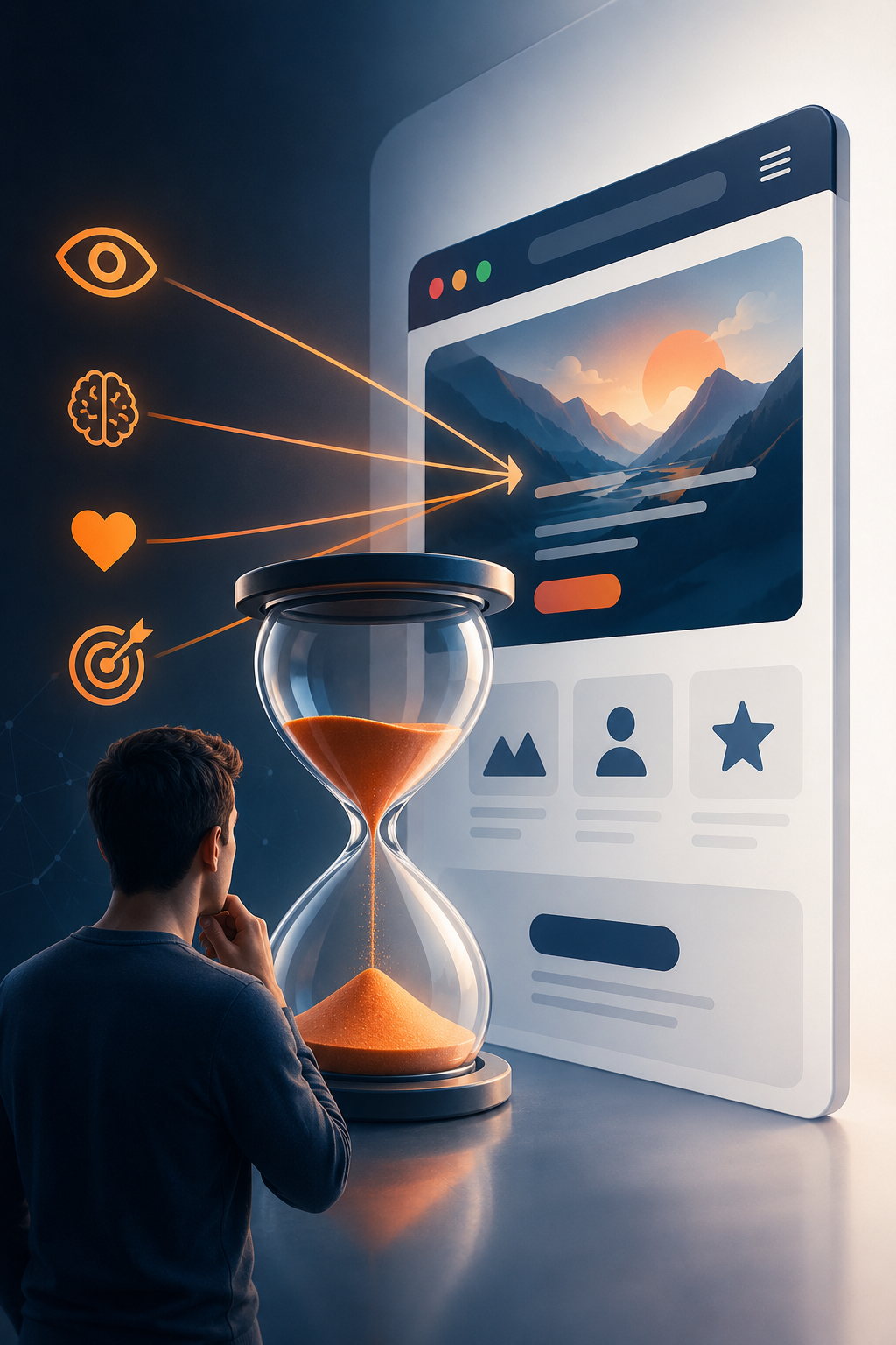
You don’t get a second chance at a first impression—and in the digital world, you barely get a first one.
We’ve all heard this age-old adage, but online, the stakes are even higher. Within just 3 seconds, users form an opinion about your website. In that tiny, unforgiving window, they subconsciously decide: Do I trust this? Is this relevant? Should I stay or leave? That snap judgment isn’t random; rather, it’s deeply rooted in human psychology, cognitive biases, and emotional triggers.
For businesses, especially those investing heavily in websites, branding, and UX, understanding this phenomenon isn’t optional—it’s absolutely critical. Together, let’s break down exactly why these decisions happen so quickly, what influences them, and how you can design experiences that make users stay, engage, and ultimately convert.
⚡ Why 3 Seconds Matter More Than You Think
Humans are inherently wired for speed.
Our brains evolved to make quick judgments as a vital survival mechanism. When we encounter something new—whether it’s a person, a place, or a website—our brain rapidly scans for cues: Is this safe? Is this useful? Does this align with what I need?
Specifically, this process is driven by thin slicing, a psychological concept where we make fast decisions based on limited information. In web design, that “limited information” includes your visual layout, colors and typography, images and graphics, and headlines and messaging.
Consequently, before users ever read your carefully crafted content, they feel your website. And make no mistake, feelings always come first.
🧠 The Science Behind First Impressions
Let’s dig deeper into what’s actually happening in those crucial first seconds of a user’s visit.
1. Cognitive Load: Keep It Effortless
When users land on your website, their brain is trying to process everything at once. If your design is cluttered, confusing, or overwhelming, it drastically increases cognitive load. Imagine walking into a room with blinking lights and loud noises everywhere; your natural instinct is to back away.
Similarly, when thinking feels like work, users leave. Therefore, a clean, structured design reduces mental effort and makes it easy for users to understand exactly where they are, what you offer, and what they should do next. Simple equals trustworthy, whereas confusing equals suspicious.
2. Visual Hierarchy: Guiding the Eye
Users don’t read—they scan. Your design must guide their attention naturally and effortlessly. This is precisely where visual hierarchy comes into play: large headlines grab attention first, subheadings provide context, and buttons direct action.
If everything looks equally important, nothing stands out. As a result, a strong visual hierarchy answers three questions instantly: What is this website about? Why should I care? What should I do next?
3. The Halo Effect: Looks Influence Trust
The halo effect is a cognitive bias where we assume that something that looks good is also credible and high-quality. Think of it like a well-dressed professional walking into a meeting; we inherently assume they are competent.
In web design, a polished UI suggests professionalism, a modern design signals relevance, and high-quality visuals imply credibility. On the flip side, an outdated design suggests an outdated business, poor layout implies a lack of attention to detail, and low-quality images signal low-quality service. Ultimately, users don’t separate design from value—they merge them entirely.
4. Emotional Triggers: Design That Feels Right
People don’t just think—they feel. Colors, spacing, imagery, and typography all trigger immediate emotional responses. For instance, blue evokes trust and reliability, red sparks urgency and excitement, and white space creates clarity and calm.
Your website’s emotional tone must align seamlessly with your brand. For example, a finance website should feel secure, a creative agency should feel bold and inspiring, and a tech startup should feel innovative and forward-thinking. Emotion drives decisions far faster than logic.
⏱️ Speed: The Silent First Impression Killer
Even before users see your beautiful design, they feel your performance.
If your website takes more than a few seconds to load, users leave—sometimes before your content even appears on their screens. Consequently, speed directly impacts trust, engagement, and conversion rates. A slow website sends a clear, frustrating message: “We’re not ready for you.” Conversely, a fast website says, “We respect your time.”
In today’s fast-paced digital landscape, patience is virtually non-existent. Therefore, optimizing your site’s speed is the very first step in winning a user’s favor.

🎯 The Role of UX in First Impressions
User Experience (UX) is not just about usability—it’s fundamentally about perception. A well-designed UX ensures that users instantly understand what your business does, how it helps them, and why they should trust you. Let’s look at key UX elements that shape those critical first impressions.
1. Above-the-Fold Clarity
The “above-the-fold” section—what users see without scrolling—is your most valuable digital real estate. Therefore, it should clearly communicate your value proposition, your target audience, and your primary call-to-action.
Avoid vague statements like, “We deliver excellence.” Instead, be specific: “Custom Web Solutions That Help Your Business Grow Faster.” Clarity always beats cleverness.
2. Navigation That Makes Sense
Confusing navigation is one of the fastest ways to lose users. Your menu should be simple, predictable, and easy to scan. Users shouldn’t have to think about where to click; if they do, you’ve already lost momentum. Remember the golden rule of UX: don’t make me think.
3. Consistency Builds Confidence
Consistency in design creates familiarity—and familiarity builds trust. Therefore, ensure consistency across your fonts, colors, button styles, and layout structure. When everything feels cohesive, users feel much more comfortable staying and exploring.
4. Mobile-First Experience
Most users today visit websites on their phones. Accordingly, if your website doesn’t look good or function smoothly on mobile, your first impression is already broken. Mobile UX should be fast, responsive, and easy to navigate with thumbs. A great desktop site means absolutely nothing if mobile users struggle with tiny text and misplaced buttons.
💡 Branding and First Impressions: The Invisible Influence
Your brand is not just your logo—it’s the feeling people associate with your business. And that feeling begins instantly. Strong branding helps users recognize your business, trust your expertise, and remember your identity. Here are the key branding elements that influence first impressions:
🎨 Visual Identity
Your colors, typography, and imagery should authentically reflect your personality. They are the visual vocabulary that speaks on your behalf when you aren’t in the room.
🗣️ Tone of Voice
Is your brand professional? Friendly? Bold? Your copy should match that tone consistently across every page, creating a unified voice that resonates with your specific audience.
📸 Authentic Visuals
Real images of your actual team, workspace, or products build far more trust than generic stock photos ever could. People connect with people, and authenticity is a powerful trust-builder.
🚀 How to Optimize Your Website for Strong First Impressions
Now that we understand the underlying psychology, let’s turn it into actionable steps for your business.
✔️ 1. Simplify Your Design
Remove the clutter. Focus only on what truly matters to your audience, and let the rest go. White space is your friend.
✔️ 2. Make Your Value Clear Immediately
Users should understand your core offering within seconds of arriving. If they have to guess, they will simply leave.
✔️ 3. Use High-Quality Visuals
Invest in professional images and graphics to elevate your perceived value. As we learned from the halo effect, looking good translates directly to being trusted.
✔️ 4. Improve Loading Speed
Optimize images, use caching, and choose reliable hosting to keep things snappy. Your site needs to keep pace with user expectations.
✔️ 5. Build Trust Signals
Include testimonials, client logos, certifications, and reviews to validate your claims. Social proof is an incredibly powerful psychological trigger.
✔️ 6. Create Strong CTAs
Use clear and action-oriented buttons like “Get Started,” “Request a Quote,” or “Book a Demo.” Tell users exactly what step to take next.
✔️ 7. Test and Improve
Use tools like heatmaps and analytics to understand user behavior. Continuously refine your approach based on real data, not just assumptions.
🔍 Common Mistakes That Ruin First Impressions
Even good businesses lose users due to avoidable mistakes. For instance, watch out for these common pitfalls that instantly erode trust:
- ❌ Too much text on the homepage, which causes instant overwhelm.
- ❌ Poor color contrast, making reading a strain rather than a pleasure.
- ❌ Auto-playing videos or sounds, which startle users and cause them to scramble for the exit.
- ❌ Broken links or outdated content, which signal neglect.
- ❌ Generic messaging with no differentiation, leaving users asking, “Why you?”
Your website shouldn’t just exist—it should perform.
🧭 The Future of First Impressions
As technology evolves, user expectations are continuously rising. Emerging trends shaping first impressions include AI-driven personalization, micro-interactions and animations, voice and conversational interfaces, and immersive experiences (AR/VR).
However, one thing won’t change: users will always judge quickly. The tools may evolve, but human psychology remains constant.
✨ Final Thoughts: Design for Humans, Not Just Screens
At its core, a website is not about pages, pixels, or code—it’s about people.
Every visitor arrives with a goal, a question, and a problem. Your job is to show—within those critical 3 seconds—that you truly understand them. When you align design, UX, and branding with human psychology, something incredibly powerful happens: users stay longer, they trust faster, and they convert more easily.
And all of that starts with a single, unrepeatable moment: the first impression.